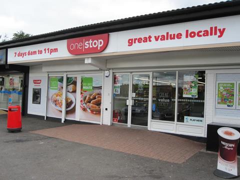
National c-store chain One Stop’s company-owned store in Hednesford, Staffordshire, is one of two branches acting as a test bed for a number of new concepts that could conceivably be rolled out to the entire estate. Store layout and customer flow has been designed with key shopping missions in mind, while the look and feel of the store has been updated with new fixtures, colour schemes and communication to shoppers. Convenience Store had an exclusive tour of the Hednesford outlet with Lizzie Reynolds, customer director at One Stop.
Zoning
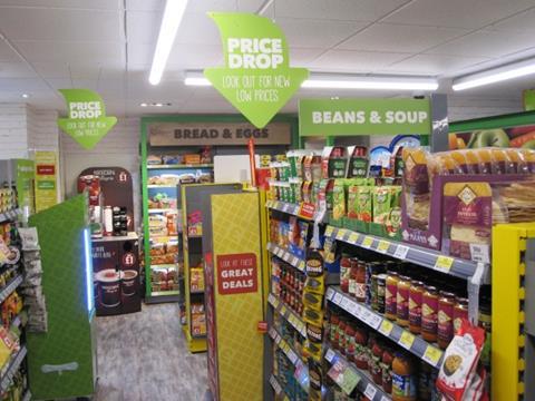
Separate zones with their own colour schemes have been created within the store
Grocery and fresh has a green theme, Big Night In is in black and purple, special offers are in yellow and the kids zone is orange and blue
A ring of strip lighting emphasises the full perimeter of the sales area, making the store feel larger. Spotlights have been added to highlight the dedicated bread & eggs fixture - these are products purchased frequently, but research has shown they are often difficult to locate
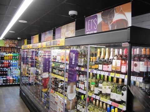
The ‘night-time’ area featuring alcohol and Big Night In lines has a darker floor and ceiling colour as well as different labelling
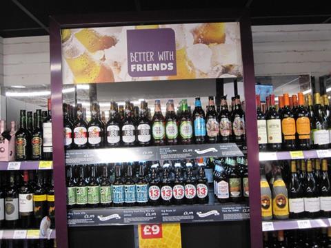
Craft ales, which up to now have been merchandised on mobile units across the estate, are given a permanent fixture.
Evening meal time
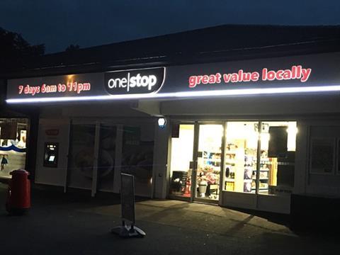
The trial stores feature the chain’s white fascia, usually reserved for conservation areas, and clear windows
A new font is designed to make the fascia stand out better at night
More natural materials such as wood are being used, along with a brick effect
The Hednesford store is being aimed particularly at the evening meal mission, so foodie graphics have been added to the exterior
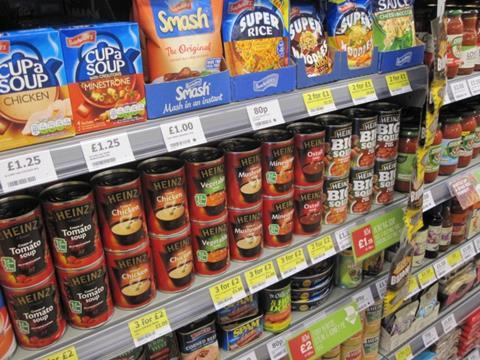
Simplicity is at the heart of retail pricing and offers, with price points ending in zero or five whenever possible.
Innovative fixtures
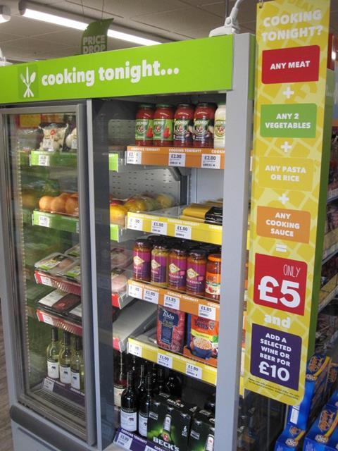
This “inspiration unit” combines both chilled and ambient shelves to provide full evening meal solutions and easy-to-reconcile meal deals. The unit is positioned directly inside the front door
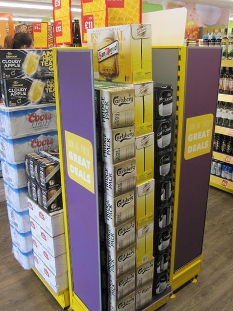
Beer stacks are a prominent feature of the One Stop offer, and this bolted metal unit (left) delivers more flexibility and discipline than the usual floor stacks with cardboard headers
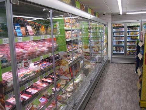
Doors are on most chillers, with the exception of milk and fruit & veg. Wood-effect shelf liners have been added to give customers confidence in the chilled range
Undershelf lighting is used across the entire store to highlight fresh and ambient products. Initial feedback from shoppers is that the store feels bigger, brighter and fresher, says Reynolds.
Fresh produce
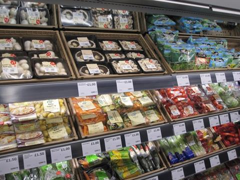
Timber-effect trays are presented at a 30-degree angle so shoppers see more produce and less fixture. Angled mirrors help shelves look full
A wider-than-usual ticket edge allows clear display of price and origin.
The CTN mission
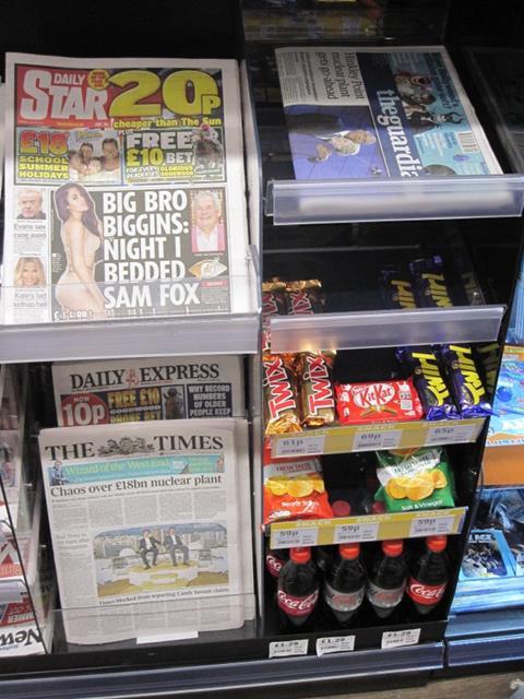
News has been taken off the perimeter walls and put on gondolas
CTN mission units like this facilitate linked deals across the categories
Kids’ mags with bulky tip-ons are merchandised flat for neatness.












No comments yet