New look for Copella juice range
2023-05-30T09:13:00

Copella has unveiled a new look and feel for its juice range
ALREADY HAVE A REGISTERED USER ACCOUNT? PLEASE LOG IN HERE
To read the full story join the ConvenienceStore.co.uk community today!
Registration is quick and easy and provides access to:
- Unlimited ConvenienceStore.co.uk articles
- Our great range of newsletters
- Content you’ve saved for later via the ‘my library’ feature
And much more…
Related articles
-

-

-

-

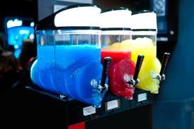
Drive soft drinks sales this summer
This content is provided by Coca-Cola Europacific Partners
-
-

More from Products
Unlimited Access + Newsletters
Register today to gain unlimited access to articles and to receive our great range of email newsletters.
© William Reed Ltd 2025. All rights reserved.
Registered Office: Broadfield Park, Crawley RH11 9RT. Registered in England No. 2883992. VAT No. 644 3073 52.
Website Terms | Privacy Notice | Cookie Statement
Site powered by Webvision Cloud






![WG-4003[58]](https://d2dyh47stel7w4.cloudfront.net/Pictures/274x183/4/5/1/353451_wg400358_6083.jpg)


